A New Era for Photography: Dry Plate Color, Pt. 2
In this segment, taken from his 2008 talk at the Museum of Modern Art, New York, for his exhibition The Printed Picture, Richard Benson walks us through the basics of color photography. He gives an overview of the Lumière Autochrome, color carbon printing, the Carbro print, dye-transfer printing, and Kodacolor and the Kodachrome prints. Pictures associated with each of the main themes presented in the segment can be found by clicking on any of the section links below.
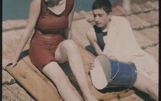
Lumière Autochrome. Photographer unknown. Bathers at Lake George. c. 1918. 6 3/4 x 4 3/4” (17.2 x 12 cm). The Museum of Modern Art, New York. Gift of Richard Benson.
The first practical photographic process in color, the Lumière Autochrome, used the additive colors of red, green, and blue. The Autochrome plate was glass coated with grains of potato starch that had been dyed these colors. The image is exposed to light and developed directly on the glass, so there was no negative from which to make copies; each Autochrome was unique. Because they were glass transparencies, Autochromes were much less useful than paper prints.
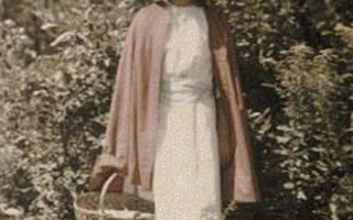
A faded Autochrome, by an unknown photographer, depicting Little Red Riding Hood dressed up for her adventure with the wolf. c. 1910. 5 x 3 1/2” (12.7 x 8.9 cm).
The first practical color process was the Lumière Autochrome, invented and marketed by the same Lumière brothers, Auguste and Louis, who made the first movies. These color pictures were on glass plates and were viewed as transparencies. They consisted of a color screen superimposed upon a black and white positive, which modulated the light going through the color screen. The wild thing about the Autochrome is that it used additive color; when the more modern color processes were developed—even those used to make transparencies—they used subtractive color exclusively. The structure of the Autochrome is so crazy that I can’t resist describing it. A glass plate was coated with tiny transparent grains of potato starch that had been dyed in the additive primaries—red, green, and blue. These colors were mixed in even proportions over the plate, which therefore appeared gray when viewed through transmitted white light.

Lumière Autochrome. Photographer unknown. Bathers at Lake George. c. 1918. 6 3/4 x 4 3/4” (17.2 x 12 cm). The Museum of Modern Art, New York. Gift of Richard Benson.
The areas between the grains were dyed black. On top of this was coated a black and white photographic emulsion, which the photographer exposed in the camera with the color-screen side facing the lens. Instead of being processed as a normal black and white negative the plate was subjected to reversal processing: the negative was developed, the developed silver was bleached out before the image was fixed, and finally the remaining silver salts were developed, producing a positive image. Once the plate had been processed and dried, it could be viewed as a transparency and appeared as a full-color photograph. The Autochrome worked because the positive image—even though monochromatic—acted to modulate the amount of light that went through each grain of dyed starch. In a red area of the picture, for example, a lot of light would have passed through the red grains onto the coating of black and white emulsion when the picture was taken.
The positive was correspondingly light in that area, so a lot of light went through the red grains when the sandwich was viewed. The green grains in that same area would have blocked the red light when the exposure was made; little light went to the plate there, the positive was correspondingly dark, so the green grains, when viewed later, were “turned off” by the heavy deposit of silver behind them. In controlling the intensity of the three additive primaries, the Autochrome worked exactly the same way as the modern television or computer screen. The brightness range of the Autochrome was limited for two reasons: the black matrix in which the grains were dispersed reduced the overall transmission of light, and saturated colors were created by diminishing the brightness of unwanted colors. To make a strong blue, the red and green grains were darkened, so saturated areas were less bright, giving the Autochrome a tonal scale unlike any other process.
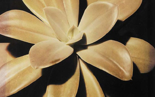
Color carbon print. Hi Williams. Echeveria. c. 1935. 16 3/4 x 13 1/4” (42.6 x 33.7 cm). The Museum of Modern Art, New York. Gift of Richard Benson.
The carbon process was ideal for color separations, because it permitted complete freedom of choice of pigment for each separation. Invented in the 1860s, color carbon became practical only in the twentieth century, after photographic materials were invented that were sufficiently sensitive to the entire spectrum of visible color.
The principle behind the subtractive method is that three black and white negatives can be made of a color subject, each exposed through a filter in one of the additive primary colors, and these three negatives will then hold all the information needed to make a full-color picture. This is of course Maxwell’s principle applied again (as it was in the Autochrome): we capture a signal in three discrete parts of the spectrum, knowing that from that information we can generate the illusion of full color.
The separation negatives were printed in the complementary colors to the filters used to make them, so that the red-filter negative was used to print cyan; the green, magenta; and the blue, yellow. Conventional chemical photographic processes could not be used to print these separations because none handled color with any versatility: silver deposits were gray in color, gold toning was purple, and iron deposits were blue.
Carbon printing, however, used pigments of any color, allowing the color of the print to be controlled by the selection of the pigment used to make the carbon tissue. If relatively pure cyan, magenta, and yellow colorants were used to make three tissues, the separations could be printed in register, one on top of the other, to make a full-color picture.
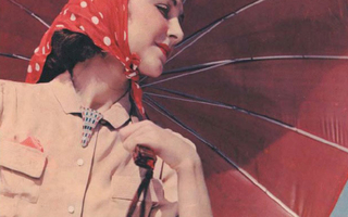
Carbro print. William Rittase. Model with Umbrella. c. 1935. 13 1/2 x 10 3/8” (34.3 x 26.4 cm). The Museum of Modern Art, New York. Gift of Richard Benson.
Carbro is a more flexible descendent of color carbon printing; it uses enlarged separations. Both carbro and color carbon require careful registration of the three color layers.
The making of color separations was the foundation of all color photography until the invention of single-sheet color materials, such as Kodachrome and Agfacolor, shortly before World War II. Those materials would use separations too, but they would be invisible, embedded in the multiple coatings of a new generation of color films and papers. In the meantime photo labs used separation negatives to make color carbons, color “carbros” (of which this picture is an example), and dye transfer prints. The carbro print was an odd duck. It was really a variation on the color carbon process, but it gained popularity in photo labs making color masters for the advertising trade. Color was moving onto the printing presses during World War II and separations would also be the basis for printing color in ink. There was a need for superb originals to be reproduced by the presses.
Since the ink separations then used would badly degrade the quality of the color, these originals had to be as good as possible. The carbro answered this need. It was controllable under lab conditions, used separations that could be manipulated and retouched, and became the color standard until the invention of modern color materials. The difference between the carbon and the carbro was in the separations and in the way the pigmented gelatin layers were hardened. Color carbon used full-sized separation negatives while the carbro used an intermediate set that were exposed to photographic paper to create a set of positives. These paper positives were bleached and placed in contact with pigment-bearing carbon tissue; the bleach migrated across to the gelatin and hardened it. After hardening, the tissue was transferred to the final support in exactly the same manner as in carbon printing.

Dye transfer print. Adolf Fassbender. Winter Berries. 1946. 15 3/4 x 12 5/8” (40 x 32 cm). The Museum of Modern Art, New York. Gift of Richard Benson © The University of Arizona Foundation.
This dye transfer print is not only quite large but also has a beautiful semimatte surface, quite different from the normal gloss used for dyes. Manufacturers have ceased producing the materials for dye transfer prints, so when dwindling private stocks are exhausted, the process will belong to the past.
The final chemical method using individual separations to make color photographic prints was called “dye transfer.” The process was designed to make superb color prints from transparencies rather than from negatives. The color original was placed in an enlarger and a set of three filtered separations was made from it. These new negatives were then exposed by contact onto a new sort of film called “matrix” film. This gelatin-coated material was exposed from the back, and processed to remove unexposed gelatin, in such a way that the remaining layer was in relief, much like a carbon print. Exposing the material from the back cut out the old carbon-print step of a second transfer to correct the reversal of the image.
Each of the resulting positives often called “matrices” was soaked in a dye of the correct subtractive color, and sequentially rolled into contact with a specially prepared receiver sheet, transferring the dye from each matrix over to the receiver. The whole operation had to be done with accurate registration, which required special easels and register pins to make sure everything fit properly. The gelatin in the matrices never moved; it remained where it was. Only the dyes transferred over to form the final image. A good dye transfer could be the best of all chemical color prints. Its quality came from the dyes used and from the physical appearance of the surface, which looked as though the image had somehow been built up, giving the print a physical presence that modern chromogenic color prints cannot match. I hedge a bit in my praise of the dye transfer process because a bad dye can be awful, but because the process was always touted as being the best, some people think even the bad ones are OK. This is a continual problem with printing processes: like celebrities, they get a reputation, and before too long this reputation can cloud the reality of the process that underlies it. Dye transfer prints were expensive and rare, and could be as bad as anything else. When they did their job well they were, like Marilyn Monroe, better than anything else around.

Kodachrome print. Photographer unknown. Mariam and James McGlone with their Piper Cub. 1946. 5 1/2 x 7 7/8” (14 x 20 cm). The Museum of Modern Art, New York. Gift of Richard Benson. This print was made directly from a Kodachrome transparency.
In the 1930s the Eastman Kodak Company introduced the first widely available color materials that could be handled by the amateur. The processing and printing still needed to be done in a lab, but Eastman had long since built up a huge business of processing and printing film exposed by the public. The new materials were revolutionary in that individual color separations were no longer needed–each single sheet of film held three sensitive layers, each producing one of the primary color records. Like the old individual separations, these emulsion coatings were black and white, but they were converted to dye images of the proper color during processing. This color revolution started with large film in sheets and movie film for professional use and was followed by 35mm and small format film for sale in the widespread and lucrative amateur market. These films and papers were miracles of construction.
The old black and white films had themselves been complicated enough to require laboratory conditions when they were manufactured—they simply could not be created at home—but the color materials only came about because Kodak, and a small number of other companies, made immense investments to build the factories that could manufacture these terrifically complex materials, and do so in the huge quantities that would make them available at a reasonable cost. The economic reality of single-sheet color materials is that they only come to us because of the advantages of mass production and carefully evolved manufacturing and marketing systems; if we tried to make a single box of 35mm color film on our own, it would cost millions of dollars. We find the same reality in the automotive industry, where the simplest mass-produced car is a miracle of refinement and accumulated experience, only accessible to the common man because of the cooperative economy in which we live. Photography had come a long way from the home-cooking techniques of its origins a hundred years before.