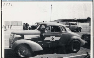
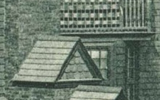
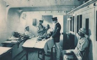
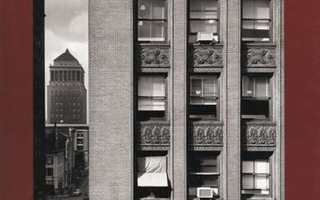
Collotype prints were backward, reversed left to right, unless the copy negatives from which they were made were reversed through a prism. Occasionally photographers would shoot with glass plates put into their cameras backward (that is, with the emulsion facing away from the lens) to produce an original camera negative from which to make the collotype plate. The sharp clarity of the print on the previous page (detail shown to the left) makes me quite certain that that was done for this picture.
On my first visit to the company I was given a tour of the shop, and my guide, the ancient owner of the plant, let me know that it had long since been accepted that collotype could only be properly practiced by workers of Teutonic extraction. (I’m not kidding about this belief—the three pressmen were named Allendorf, Zande, and Brecklin.) The process was complicated, terribly unpredictable, and erratic at best; but when everything went well, a fine collotype could hold its own against the best of photogravure. Collotype presses were huge, holding a flat glass printing plate on a massive bed that ran on steel rollers, like a railway truck.
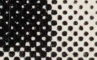
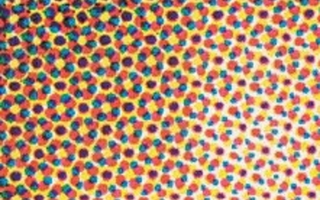
The bed moved beneath a set of ink rollers and then under a cylinder big enough to hold the large sheet used for book work. The paper wrapped around this cylinder came into direct contact with the printing plate, and the ink was transferred in a single impression. This arrangement—of the paper directly meeting the plate—was the weak link in collotype, because it was a lithographic process, using a moist plate, and the dampness striking the paper inevitably changed the paper’s dimensions. This doomed collotype to be a single-impression process, since the sheets could never dependably be registered for multiple impressions. We find some color collotype, but it is rare, and almost never in perfect register. The old-timers who printed collotype used to say that the way to do a fine limited edition in the process was to print twice as many sheets as needed, spread them out on the floor, and pick out the best ones. There was some truth in this: because collotype plates were dampened manually during the printing, the tone of the impressions varied from sheet to sheet.