A New Era for Photography: Dry Plate Color, Pt. 1
In this segment, taken from his 2008 talk at the Museum of Modern Art, New York, for his exhibition The Printed Picture, Richard Benson walks us through the basics of color theory. He gives an overview of contact printing, the primary colors, James Maxwell’s theories of color, and color separations. Pictures associated with each of the main themes presented in the segment can be found by clicking on any of the section links below.

Behr Paints and the Walt Disney Company. Paint sample display. 2007.
Color is the most subjective of all qualities; I really don’t know whether or not the red I see is the same as the red someone else does. For centuries the only practical way to define color was to show samples of it. Color photography and computer imaging require a more scientific understanding of color, and this brief section touches upon this immensely complex subject.

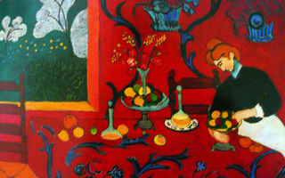
Oil on canvas. Henri Matisse. Red Room (Harmony in Red). 1908. 70 7/8 x 86 5/8” (180.5 x 221 cm). State Hermitage Museum, St. Petersburg ©Succession H. Matisse, Paris / Artists Rights Society (ARS), New York.
Red, yellow, and blue are a perfectly appropriate set of colors for the painter to think of as primary in work in that medium, but as we engage the modern technologies of color photography and digital display, we must dig deeper and try to understand just what the term “primary color” might mean. For the painter the term “primary” refers to a color that stands by itself as a visual entity, instead of being generated by mixing other colors. We know today that a pure magenta can be mixed with yellow to produce red, but in the past, painters used earth-based pigments that were never so pure as to produce good color when mixed. When we paint we are dealing with a form of color called “subtractive” color. Most painting entails the assumption that the support is light in value (often the white of gesso, applied to the canvas as a primer, or of bright paper) and that the paints “subtract” particular colors from this whiteness by absorbing light as it passes through them.
This is true when the paint is transparent, such as watercolor, and even to some extent when the paint is relatively opaque, like oil, which can be applied with some degree of transparency. As printing technologies developed and attempts were made to print in color, it became obvious that the subtractive principle could be used, and that transparent inks in a limited number of colors, applied overlying each other, could produce many additional colors not present in the actual ink set. This interesting fact lies at the foundation of all modern color printing, whether in ink on presses or in the traditional materials of color photography in the darkroom.

The first set of primary colors, used in painting, eventually in printing, and later still in photography, is called the subtractive primaries: cyan, magenta, and yellow.
The first person I am aware of to grasp the scientific basis of subtractive printing was the Scottish physicist James Clerk Maxwell. In the mid-nineteenth century he stated that three widely spaced points in the spectrum could be chosen, and that the colors at these points could be combined in varying levels of brightness to produce virtually every color we can see. In arguing this Maxwell also made the point that there are actually two different sets of three primary colors. One set, used in painting, eventually in printing, and later still in photography, is called the subtractive primaries: cyan, magenta, and yellow. Please note that although cyan and magenta are close relatives of blue and red, they are not the classic primaries of the painters. The second set, used when mixing projected (rather than reflected) light, is called the “additive primaries,” and these are red, green, and blue. The three additive primaries with which we see—red, green, and blue—are intimately connected to the three subtractive primaries—cyan, magenta, and yellow—with which we print. The relationship between these two color sets must be understood by anyone working with photography, printing, and digital images.

The second set of primary colors, used when mixing projected (rather than reflected) light, is called the “additive primaries,” and these are red, green, and blue.
As we spend our days reading books and magazines and then looking at the computer and the television set, we move effortlessly between the worlds of print and projection (the first subtractive, the second additive). If we have any hope of photographing with digital tools, then both systems must be seen as parts of a single whole, with additive and subtractive color working together seamlessly in a system based upon six primary colors. The red, green, and blue, seen against a black background, represent what we might see if three slide projectors each had a color filter over the lens and each projected one color circle. The second image, showing these same three circles moved closer together so that they overlap, accurately describes how projected, or additive, primary colors add up: red and blue light make magenta, blue and green make cyan, and green and red make yellow. The first two combinations follow our instinctive sense of how the primaries would mix: magenta and cyan seem to be logical productions of the overlap. The third—green and red making yellow—is not intuitive at all, and remains one of the most surprising aspects of additive color.
Where all three colors overlap we see white light. This is a clear demonstration of the flip side of Isaac Newton’s great observation that white light contains all the colors, which he demonstrated using a prism. Here we see those same colors mixing together to produce white (which Newton also demonstrated). The three circles of color on a white ground represent spots of printer’s ink printed on white paper. These are the subtractive primaries—cyan, magenta, and yellow—which, when overlapped as in the fourth illustration, produce blue, red, and green. Where all three inks combine, the image is black.

A digital photograph made by Richard Benson. © Richard Benson.
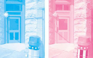
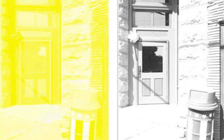
The way in which Maxwell’s work has been used, in both printing and photography, is through color “separations.” His principle of selecting three points in the spectrum and recording the color values at those points to define a wide range of colors found a practical application through photographic records of colored objects made with filtration in the primary colors. These color separations were routinely made with red, green, and blue filters to record the values that were subsequently printed with cyan, magenta, and yellow. Color photography, which we come to in the next section, uses complex coatings with three light-sensitive layers that each respond to a particular primary, all applied to a single substrate. The examples shown on the next pages are a hypothetical set of color separations made to be printed in the subtractive primaries of cyan, magenta, and yellow. On the printing press these separations need to be accompanied by a fourth printer that uses black ink, denoted by the letter “K” (the letter “B” was not used to avoid confusion with blue), leading to the abbreviation CMYK for this system of printing.

A sample set of color separations: starting left, cyan; magenta. These are single impressions of the actual separations used to make the full-color reproduction on the first page. © Richard Benson.
In an ideal world the three primaries, when printed together at full strength, would produce a black value, but things don’t work out that way: the dyes or pigments in the inks are not strong enough, and it is very difficult to print three heavy layers of wet ink on top of each other. These problems are solved by using a fourth printer, in black ink, which only affects the darker values in the picture. Photographic papers need no black layer, since the dyes are stronger, and there is none of the handling difficulty that exists with heavy layers of ink.

A sample set of color separations: starting left, yellow; and black. These are single impressions of the actual separations used to make the full-color reproduction on the first page. © Richard Benson.