Color Inks and Other Techniques, Pt. 1
In this segment, taken from his 2008 talk at the Museum of Modern Art, New York, for his exhibition The Printed Picture, Richard Benson walks us through the process of color printing. He gives an overview of hand-coloring and stencil, the two-color letterpress, multipass intaglio printing, chromolithography, Japanese woodblock printing, and monotypes. Pictures associated with each of the main themes presented in the segment can be found by clicking on any of the section links below.
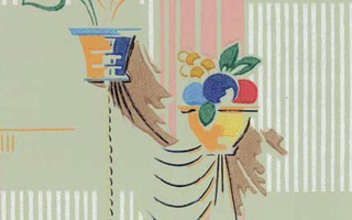
Relief-printed wallpaper. American. c. 1920. 11 x 7 1/2” (28 x 19 cm).
Color printing began with the simple expedient of using inks of different colors—if a particular color was needed then an ink was mixed to match it. In the twentieth century, color printing turned into a different system based upon the mixing of primary colors. The earlier method continues to this day, and we briefly trace its history in this section. Primary colors and their use in color printing are dealt with in Color Notes.
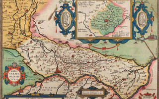
Hand-colored copper engraving. Antonius Campus. Map of the Fields of Cremona. 1579. 13 3/4 x 19 13/16” (35 x 50.3 cm). The Museum of Modern Art, New York. Gift of Richard Benson.
This map is an engraving, printed in black ink from a single copper plate. Once the sheet was dry it was colored by hand, using watercolors. It is hard to tell whether the colors were applied by painting or put on with stencils, to give some repeatability to the washes throughout the edition. In either case this picture is really both a print and a painting, part of its information deriving from a printing plate and part coming from the hand. If the map was painted, the colors were applied with a brush, but if it was stenciled the artist probably used a cloth ball called a “dauber,” patting it first on an ink source and then gently on the print surface.
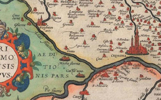
Detail of Hand-colored copper engraving. Antonius Campus. Map of the Fields of Cremona. 1579. 13 3/4 x 19 13/16” (35 x 50.3 cm). The Museum of Modern Art, New York. Gift of Richard Benson.
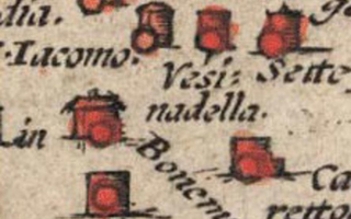
Detail of Hand-colored copper engraving. Antonius Campus. Map of the Fields of Cremona. 1579. 13 3/4 x 19 13/16” (35 x 50.3 cm). The Museum of Modern Art, New York. Gift of Richard Benson.
The small red spots applied to the individual towns have been rapidly painted by a dab with a brush, for which no stencil was necessary.
Stencilers also used specialized round brushes, which could be held vertically to apply controlled amounts of color. When properly used these tools could create the blended edges of the colors that we see along the river borders on the map. Often the stencils, cut in stiff paper, could give a hard, sharp edge that looks just as if it has been painted with a conventional brushstroke; then the dauber, carefully applied, could produce a blend on the other side. We can see such an application in the upper left of the map, where a yellow area meets a red, without a black engraved line obscuring the join. The technical term for a black-and-white print colored through the use of stencils is “pochoir,” a French term for “stencil.”

Two-color letterpress. Jeremy Collier. Title page from The Great Historical, Geographical, Genealogical and Poetical Dictionary. 1701. 14 3/4 x 9” (37.5 x 22.9 cm). The Museum of Modern Art, New York. Gift of Richard Benson.
When printers began to add color by printing more than once on a single sheet of paper, they encountered the problem of registration—the alignment of the two impressions with each other. In this example, the layout of the type leaves plenty of room for error.
Where the hand-colored and stenciled map combined single-impression printing with hand coloring, this sheet was printed in two colors using a press for both. Two different forms of type were set, the one to be printed in black leaving blank spaces where the red words would go, the one to print red being mostly empty to accommodate the black impression. The sheet was put through the press twice—the black surely printed first—and the hand press was carefully manipulated to impress the red words as accurately as possible in their intended location. Registration on these early presses was crude at best. Our example was laid out so that no part of the print required absolutely accurate registration; the two impressions needed to be fitted to each other within only about a sixteenth-of-an-inch tolerance to be acceptable.
There are two ways to print a picture in more than one color. The simplest method is to ink different parts of the form with different colors. This was sometimes done when there was a large capital letter at the start of a page or section; it was relatively easy to ink that one letter with a bright color, such as red or blue, and then ink the rest of the form with black. When printed the two colors would be in perfect register, since the type was never moved and the sheet was printed only once. Other decorative initials were simply colored in by hand, so they are similar to the hand-colored map. The other way to print in multiple colors is with the method used for this sheet. The practice of putting a piece of paper through the press more than one time has become the basis of all complex color printing. The biggest problem faced in the development of this multiple-impression technique was to achieve accurate registration of the two images. Our example, made by letterpress, was printed on tough rag paper that was dampened before printing. Because the paper was printed wet, it varied slightly in size from one pass to the next, which meant that multiple impressions could never be registered accurately enough to print pictures.
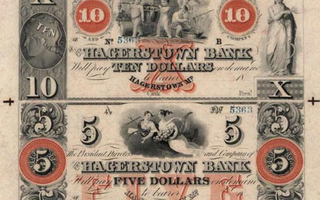
Two-color steel engraving. Danforth, Underwood & Company. Uncut banknote proof sheet. c. 1839. 12 1/4 x 7 3/4” (31.1 x 19.7 cm). The Museum of Modern Art, New York. Gift of Richard Benson.
By the mid-nineteenth century, paper money was often printed in color. This uncut sheet shows registration marks on its border.
Sometimes one comes across a piece of printed paper that is pure pleasure to look at. This sheet of currency, one of the most beautiful things I own, fits nicely into our examination of multiple-impression printing. It is an uncut sheet, intaglio printed, that retains its original borders and registration marks. The bills were probably printed sometime between 1839 and 1842, because the names of two banknote-engraving companies appear on each bill, and we have records that one of the companies was created in 1839 and that they combined into a single organization, with a different name, in 1842. In the early years of the nineteenth century banks issued a huge variety of currencies, which were printed by many engravers. In 1863 the U.S. government put a stop to this and became the country’s sole issuer of paper money.
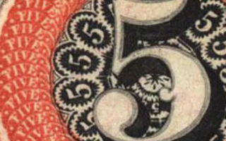
Detail of Two-color steel engraving. Danforth, Underwood & Company. Uncut banknote proof sheet. c. 1839. 12 1/4 x 7 3/4” (31.1 x 19.7 cm). The Museum of Modern Art, New York. Gift of Richard Benson.
Mechanical methods capable of decorative details such as these had appeared by the mid-nineteenth century. The filigreed orange circle around the fives was engraved or etched by a pantograph working from a larger image.
At about the same time, virtually all the small printers of currency merged to become the American Bank Note Company, which remained active until electronic banking reduced the need for paper bills in the late 1990s. Unlike the older etchings and engravings, this sheet was not printed by hand: although intaglio printing remains a hand process for “art” prints even today, mechanical methods emerged early on to meet the need for huge editions of currency, postage stamps, and fancy certificates. The paper is very thin, about .002 inches thick (.05 mm), and the quality of the registration speaks of a sheet printed dry, instead of dampened, as hand printing required. The two colors on this sheet—black as the key impression, orange as the second—were both printed from steel plates that had been etched and then engraved.
The four register marks—the crosses in the margins—demonstrate the oldest method of aligning multiple impressions. On modern presses, in almost all of the processes, the impression is light and the paper undergoes little distortion. Before the invention of rotogravure in the late nineteenth century, though, intaglio always distorted the sheet severely, and a second impression could never be aligned exactly with the first. The compromise solution to this problem was to use four register marks on the borders, arranged like those on the sheet of currency shown, which could be aligned as well as possible. This gave the center of the sheet the best “fit”; registration errors increased toward the edges. In the early years of the United States, currency was printed by plain old letterpress, but it always had a shaky reputation and coin was regarded as the genuine specie. It is no wonder that intaglio printing became the standard for money because its rich appearance gives some sense of solidity to the bills. Today there are hordes of currency collectors and I have always thought part of the attraction they feel toward old money is based on its visual beauty.
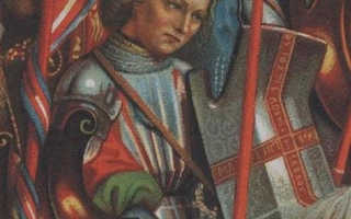
Detail of Chromolithograph. Hubert and Jan Van Eyck. Panel from The Ghent Altarpiece. c. 1432 (Printed by Storch & Kramer, 1877). 15 3/8 x 5 1/8” (39 x 13 cm). The Museum of Modern Art, New York. Gift of Richard Benson.
Chromolithography reached an extraordinary level of complexity. This picture reproduces one of the four lower side-panels from Hubert and Jan van Eyck’s Ghent Altarpiece of 1432. The full panel, is 15½ inches (39 cm) high in the reproduction. In details we can see the delicate stippling that has been used to generate the appearance of many colors and tonal variations. The stippling is far finer in the heads of the crusaders than in the rest of the picture, as though the human being deserved more care in the reproduction than did the flora and fauna. There was no photomechanical method allowing the printer to draw large and then print smaller. I have long since given up trying to figure out how many colors were printed in this reproduction. At least eight stones were used and perhaps many more.
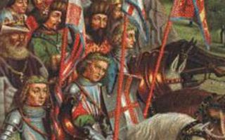
Chromolithograph. Hubert and Jan Van Eyck. Panel from The Ghent Altarpiece. c. 1432 (Printed by Storch & Kramer, 1877). 15 3/8 x 5 1/8” (39 x 13 cm). The Museum of Modern Art, New York. Gift of Richard Benson.
The color separations have nothing to do with the scientifically based separations used today for “process” color printing. Instead the separator has chosen the key colors in the picture, drawn separations for those, and used stippling to make blends for intermediate colors and tones. Like Japanese woodblock prints, this picture shows an astonishing degree of technical skill. In both cases the printers were making a copy—their job was strictly to reproduce a piece of original art, without embellishing or altering it at all. In the case of the chromolithograph the printer must have used the original painting itself, or some hand-painted copy of it, as a guide. For the Japanese woodblock, the artist’s painting, and perhaps even the artist himself, were nearby to direct the work. In both cases there was no room for expression on the part of the printer, beyond the goal of being completely invisible for the sake of the job at hand.
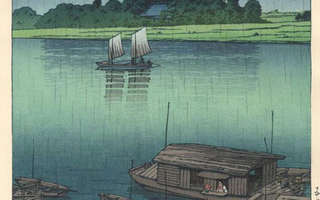
Japanese woodblock printing. Kawase Hasui. Early Summer Rain. c. 1940. 14 3/4 x 10 1/8” (37.5 x 25.7 cm). The Museum of Modern Art, New York. Gift of Richard Benson © S. Watanabe Color Print Co. and Kawase Fumiko.
Japan has a long history of producing extraordinary color prints using multiple woodblocks that are inked with subtle gradations of color. The best of them have tonal and color variations whose complexity and beauty rival the watercolor paintings upon which they often were based.
Japanese woodblock prints illuminate a crucial principle of color pictures. This is that the color decisions of an artist (and in this case a printer as well) working with pigments or dyes can create a set of relationships within a picture that form the foundation of its meaning. This particular print is about two different greens, two different blues, and their interaction to produce transitional shades. The brown used in the boats, small accents of other colors, and the black key plate support these picture-defining colors, but the artist has stated the theme of the picture through the blue-green structure. This is what painters have always done with color, and this level of refinement has always showed up in the best original printmaking.
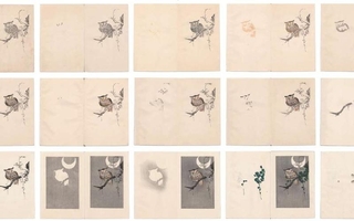
Color woodblock progressives. Artist unknown. Publisher’s process book. c. 1930. Approximately 5 1/2 x 7 1/8” (14 x 18.1 cm) each. The Museum of Modern Art, New York. Gift of Richard Benson © S. Watanabe Color Print Co. and Kawase Fumiko.
Photography, the new and dominating picture medium of our time, had no method for handling color in this way until the recent introduction of digital tools. Japanese woodblock printers would occasionally make small booklets showing the progressive stages of a single print. We see on the previous page the fifteen stages of a small print of an owl in a tree. In modern color printing, such as four-color process, each printing plate holds information for the entire picture. In handmade color such as this woodblock print, the artist has the option of making color decisions about separate parts of the picture. We see this clearly, since individual parts of the owl and the tree each have their own blocks and colors. In this print the color structure of the picture tends to be about discrete steps of tone and color rather than smooth transitions between broad areas.
Cave Walls (see Relief Printing)
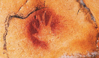
Pigment prints. Artist unknown. Hands from the walls of the Chauvet cave, Ardèche, France. c. 30,000 B.C. © Jean-Marie Chauvet, Eliette Brunel Deschamps, and Christian Hillaire.
Mixed in with the hand-drawn pictures in the caves are clear examples of printing. The most common of these printed pictures are of the human hand. Sometimes the image is dark, obviously made by impressing a pigment-covered hand onto the wall, while in other cases the hand appears as a negative, clear but surrounded by colored material. The hands we find in prehistoric caves represent two of the fundamental forms of printing. The positive images (those made by the hand itself carrying the pigment) are examples of relief printing, the system that underlies printing with moveable type or with wood or linoleum blocks. The negative images (those blank hands surrounded by colored pigment) are examples of stencil printing, in which image-bearing pigment is passed through or around some form that holds the picture information.
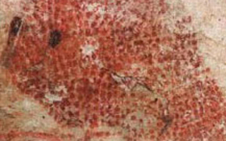
Pigment prints. Artist unknown. Hands from the walls of the Chauvet cave, Ardèche, France. c. 30,000 B.C. © Jean-Marie Chauvet, Eliette Brunel Deschamps, and Christian Hillaire.
This painting, dating from about 15,000 years ago, is from the cave at Marsoulas in southern France. The image has been built up by blowing dots of red pigment onto the cave wall; this pictorial form, of assembling a picture with random dots, is virtually identical to the stochastic printing used by some digital printers today.