Photography in Ink: Relief and Intaglio Printing
In this segment, taken from his 2008 talk at the Museum of Modern Art, New York, for his exhibition The Printed Picture, Richard Benson walks us through the use of relief and intaglio printing in photography. He gives an overview of wood-engraved photographs, random screen halftone prints, ruled halftone screens, the letterpress halftone, magazines, the duotone letterpress halftone, processing color in relief printing, the flat-plate photogravure, the art photogravure, and rotogravure using mechanical screens. He also briefly discusses how we determine print quality. Pictures associated with each of the main themes presented in the segment can be found by clicking on any of the fields below.
Photography in Ink: Relief and Intaglio Printing Introduction (00:26 - 01:46)
-
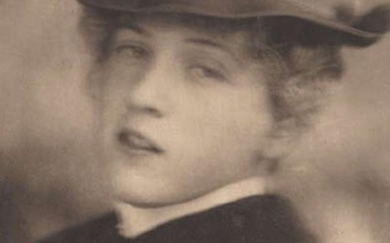 Hand photogravure. Alfred Stieglitz. Miss R. from Camera Work, no. 12, October 1905., 1904. 8 1/8 x 5 1/2" (20.7 x 14 cm). The Museum of Modern Art, New York. Gift of Richard Benson © Georgia O’Keefe Museum / Artists Rights Society (ARS), New York.Three of the ink-printing methods—relief, intaglio, and planographic—adapted to the photographic image. Intaglio printing did so first, with the invention of photogravure. Planographic printing was second, in the form of collotype. Relief printing, the oldest of all, was the last to make a workable adaptation, but it ended up with an inexpensive and tremendously successful method in the single-impression halftone. An examination of photography in ink could begin with relief and intaglio because they are the oldest processes.Hand Photogravure
 -
 Halftone print. Henri Cartier-Bresson. Sunday on the Banks of the Marne, France. 1936–38 (Printed 1947). 4 x 5 7/8” " (10.2 x 14.9 cm). Letterpress printed halftone from Henri Cartier-Bresson (New York: The Museum of Modern Art). © Henri Cartier-Bresson/Magnum, courtesy Fondation Henri Cartier-Bresson.Halftone Print
 -
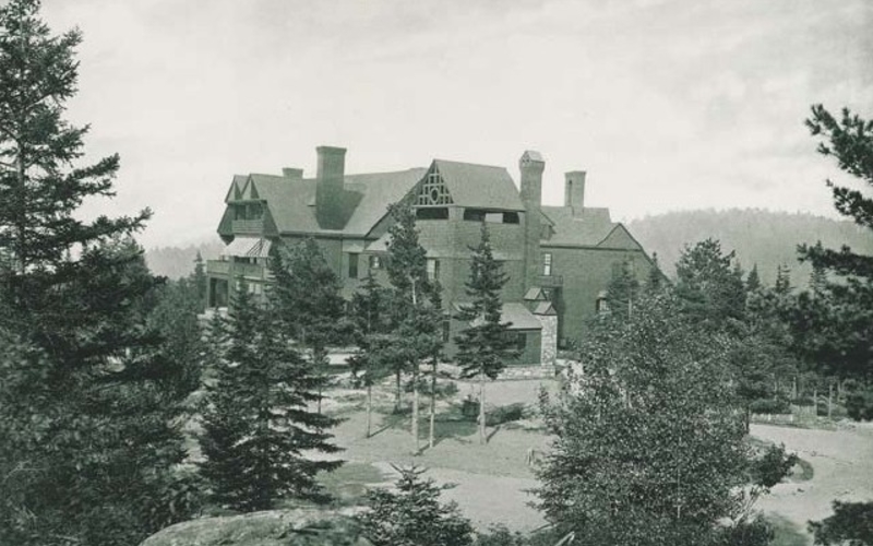 Collotype. Photographer unknown. Shingle-style house. c. 1910. 12 11/16 x 11 3/4" (32.2 x 29.9 cm). The Museum of Modern Art, New York. Gift of Richard Benson. Collotype printers were mysteriously casual about color, and collotypes range from blue to green to brown to neutral, with no apparent logic.Collotype
The Question of Print Quality (01:46 - 03:38)
-
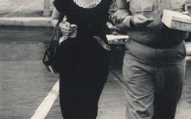 Rotogravure. Robert Frank. Savannah, Georgia. 1955. 13 7/16 x 10 1/16" (34.1 x 25.5 cm). The Museum of Modern Art, New York. Acquired through the generosity of the Young family in honor of Robert B. Menschel © Robert Frank. From the 1959 edition of The Americans, printed in rotogravure (Paris: Delpire).When chemical photography is translated into ink, the quality of the reproduction varies tremendously. Even under ideal conditions every printing process would alter the image it reproduces; in the practical world, where publishers’ schedules are tight, budgets are limited, and the printer must struggle with his craft, reproductions can often turn out terribly. There has been a steady increase in the quality of ink reproductions of pictures, and today it is possible to make superb books that do justice to the original chemical prints, but this state has been long coming. These two prints, reproduced here and the next page quite accurately, are from two different editions of Robert Frank’s great book The Americans.Rotogravure
 -
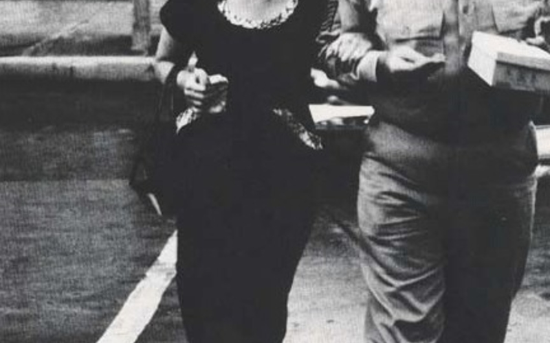 Photo offset lithography. Robert Frank. Savannah, Georgia. 1955 (Printed 1959/1969). 6 11/16 x 4 1/2" (17 x 11.5 cm). The Museum of Modern Art, New York. Gift of Richard Benson © Robert Frank. From the 1969 edition of The Americans, printed in photo offset lithography (New York: Aperture).The version on the previous page is from the first printing of the book plates, done in Europe in 1958, in rotogravure. The one on the left is from the second edition, printed in the United States in 1969, in photo offset lithography. The gravure version (actually published in two editions, with different texts but the same plate pages) is clear and lyrical in its photographic description. The offset version, heavy, plugged up, and rough, was made in the early years of offset, before that technology was working very well. Few copies were made of the gravure edition but many thousands were produced of the offset edition. A complex picture of America is there on the gravure version, but sadly missing in the far more influential print on the left.Photo Offset Lithography
Wood-Engraved Photographs (03:38 - 06:52)
-
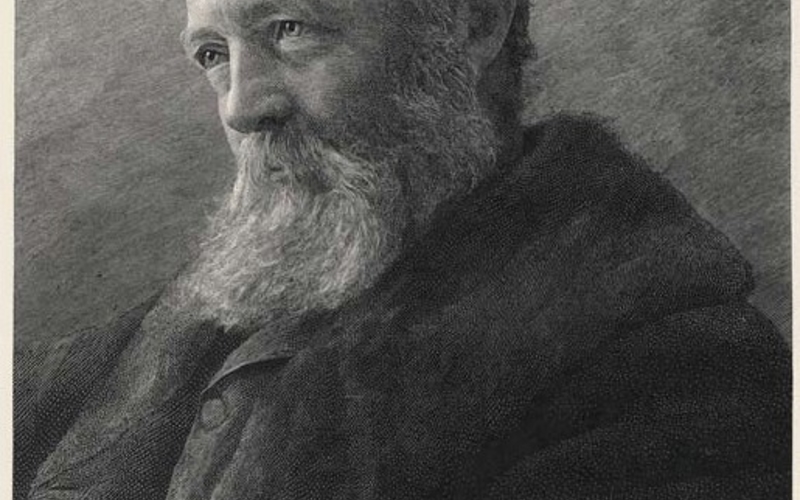 Wood engraving. James Notman. Frederick Law Olmsted from The Century, Series 24, issue 46 (May-–October, 1893). c. 1893. 7 1/2 x 5 3/8" (19 x 13.6 cm). Printed by T. Johnson. The Museum of Modern Art, New York. Gift of Richard Benson. The invention of the dry-plate negative around 1880 made photographs radically easier to make. The subsequent development of practical techniques for mechanically translating photographs into ink vastly enlarged the potential for disseminating photographic imagery to an ever-larger audience. Once these two revolutions were in place, in the early twentieth century, photography’s lens-based descriptions became as ubiquitous and indispensable as written language.The picture on the left originated as a chemical photograph—the photographer is even given a credit line—but the print we see was made from a hand-cut wood engraving. The sequence by which this happened went as follows: (1) the photograph was taken (probably around 1880) using an early dry plate. (2) This negative was printed with a light-sensitive coating that had been applied to an end-grain wooden block. (3) A carver laboriously engraved the block by hand, working with a burin and using the image printed on the wood as a guide.Wood Engraving
 -
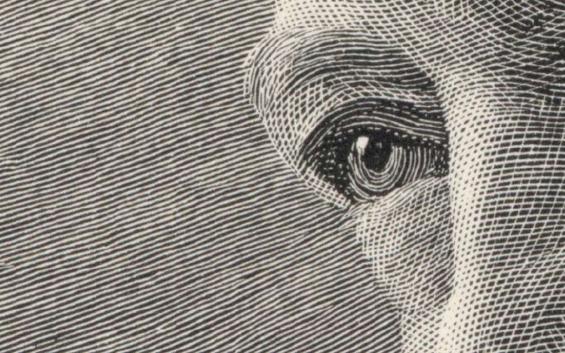 Detail of Wood engraving. James Notman. Frederick Law Olmsted from The Century, Series 24, issue 46 (May-–October, 1893). c. 1893. 7 1/2 x 5 3/8" (19 x 13.6 cm). Printed by T. Johnson. The Museum of Modern Art, New York. Gift of Richard Benson(list continued from previous page) (4) The finished block was locked up with type in a chase. (5) This composite was used to generate a stereotype (a thin metal replica, shaped to fit a cylinder), and (6) this plate, along with a group of others, was mounted on the cylinder of a rotary printing press, to be printed at high speed for use in the magazine The Century. This detail of the previous plate, enlarged eight times from the size of the actual wooden block, shows the extraordinary network of lines that was hand engraved with no tools other than the guide photograph, a handheld burin, and a magnifying glass.Detail of Wood Engraving
 -
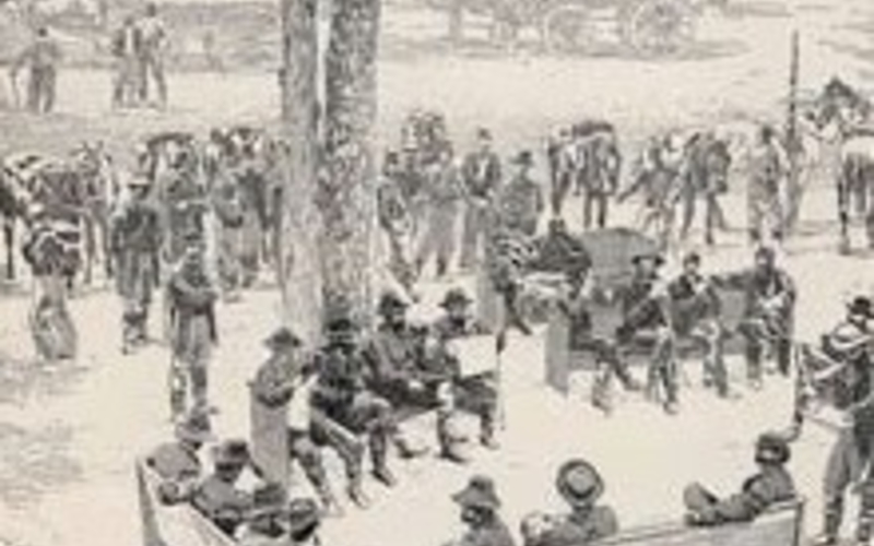 Wood engraving. Timothy O’Sullivan. General Grant with Staff at Bethesda Church from The Century magazine, vol. XXXIV, May 21, 1864. 1864. 5 5/8 x 5 1/4" (14.3 x 13.3 cm). Printed by Isaac Walton Taber. The Museum of Modern Art, New York. Gift of Richard Benson.Photography was mature by this time, and was replacing handwork in the task of gathering data for widespread dissemination by the printing press. The presses themselves were fast, driven by the equally mature steam engine. The odd part of the whole process was that the hand still played an important role in translating the photograph into printable form. It seems that this task of translation should have been easy, but it was actually extremely difficult. The technologies of photography and printing were both well advanced before the emergence of the simple dot-bearing halftone, which ultimately replaced hand engraving.Wood Engraving
 -
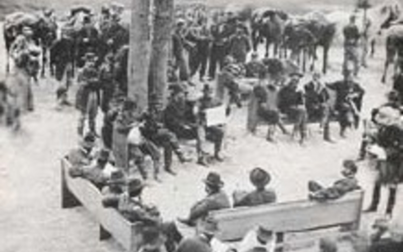 Timothy O’Sullivan. General Grant with Staff at Bethesda Church. May 21, 1864. As a mediocre half-tone, printed c. 1966.To this day the task of converting a photograph into ink is fraught with problems—a seemingly simple chore, it almost never turns out correctly. There are various ways in which this translation has been done and many challenges that have so often led the process astray. The fundamental problem is that photographs have tonal gradations that ink, when printed by relief or planographic processes, does not. Black ink is always black—it either goes down on the sheet and makes a black mark or it is not there and the paper is white. The solution to this problem has always been to break the picture up into small particles and to vary the size or number of those particles to emulate tone. The wood engraving we see here achieves this through an incredibly refined set of hand-cut lines. When these small marks cover a large percentage of the paper surface the tone appears dark; when they are small or widely separated, that part of the picture looks light. There are difficulties faced in carrying out this variation through mechanical means, with no assistance from the mind of such craftsmen as the engraver who made this block.Wood Engraved Photograph
Random Screen Halftones (06:53 - 09:11)
-
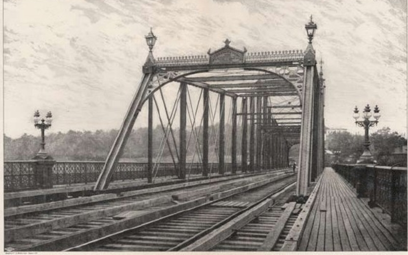 Random screen halftone. Sprague & Co. Haarlem River Bridge, Eighth Avenue, New York; West Side and Yonkers Railway. 1882. 11 1/4 x 17" (28.6 x 43.2 cm). The Museum of Modern Art, New York. Gift of Richard Benson.The hand-cutting of photographs could only go on for so long before some mechanical method was developed. I need to emphasize here that we are examining relief printing, which in the nineteenth century usually meant letterpress—the metal type used in letterpress printing was creating more pages than all other processes combined. Yet it lagged behind in the mechanical translation of photography into ink. Gravure and collotype (the former an intaglio and the latter a planographic process) offer translation methods far earlier than did relief printing. This plate comes from an engineering manual made in the early 1880s.Random Screen Halftone
 -
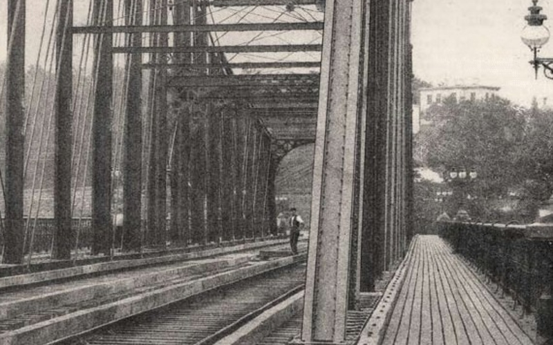 Detail of Random screen halftone. Sprague & Co. Haarlem River Bridge, Eighth Avenue, New York; West Side and Yonkers Railway. 1882. 11 1/4 x 17" (28.6 x 43.2 cm). The Museum of Modern Art, New York. Gift of Richard Benson.The picture was obviously derived from a photograph—it has the rigid perspective that could only have been drawn by a wide-angle lens. It also has an odd background of trees and sky that would never have been described this way by an artist making an original work; the trees running along the midline of the picture are a nearly amorphous blob of middle tones—not the sort of thing one would have created intentionally. To top it all off we have a tiny man standing on the bridge, just to the left of the girders on the right side of the superstructure. From photography’s earliest days figures were placed in pictures to demonstrate the scale of the thing being photographed.Detail of Random Screen Halftone
 -
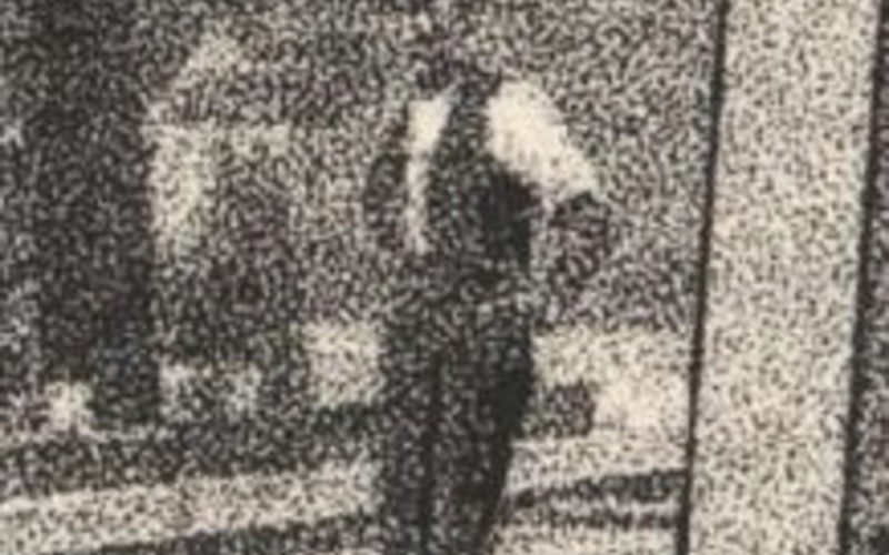 Detail of Random screen halftone. Sprague & Co. Haarlem River Bridge, Eighth Avenue, New York; West Side and Yonkers Railway. 1882. 11 1/4 x 17" (28.6 x 43.2 cm). The Museum of Modern Art, New York. Gift of Richard Benson. A detail enlarged four times from the original to show the random grain, which translated the photograph’s tones into binary marks that could be printed.The print is a true oddity—a reproduction made photomechanically by rephotographing the original photograph through a screen of prepared glass that broke up its tones into a random grain. The principle would be systematized in the letterpress halftone, but there the grain would be regular. It is impossible to know just how the screen was made, but it looks as though it was produced from a collotype. The exciting step we see here is that the screen has done the job of translating tone into a pattern of discrete black and white marks. This was first attempted (as far as we know) by Talbot, the inventor of paper-based photography. It took forty years, from his early trials in the 1840s until the mid- 1880s, before this revolutionary idea could be made to work with any dependability.Detail of Random Screen Halftone
Ruled Halftone Screens (13:39 - 16:27)
-
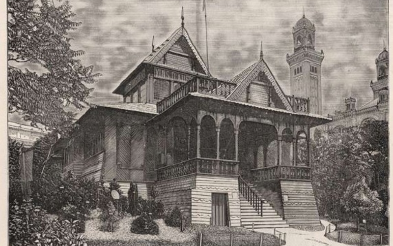 Wood engraving and halftone print. Photographer unknown. The Pavilions of the Paris Exhibition. 1889. 15 x 10" (38.1 x 25.4 cm). The Museum of Modern Art, New York. Gift of Richard Benson.This extraordinary sheet comes from a large book celebrating the Universal Exhibition in Paris in 1889. The page doesn’t look very impressive until we realize that it shows two photographs, the upper one printed as a wood engraving, the lower as a primitive mechanical halftone. Here we find the old and the new locked up together in a letterpress form. Metal type even shows up on the same sheet—so we have letters made in a lead alloy, hand-generated marks in boxwood, and a chemically etched copper plate tacked onto a wooden support, all working together to generate our sheet. This picture indisputably comes from a photograph, simply because it shows no evidence of the hand. In each case the photographer has stood somewhat to the side of the building, to show its shape, and in both cases he used a fairly wide-angle lens.Wood Engraving and Halftone Print
 -
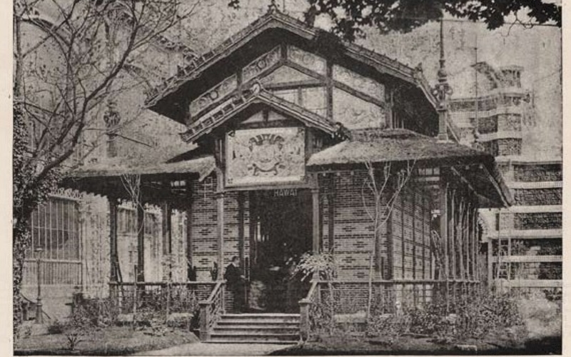 Wood engraving and halftone print. Photographer unknown. The Pavilions of the Paris Exhibition. 1889. 15 x 10" (38.1 x 25.4 cm). The Museum of Modern Art, New York. Gift of Richard Benson.No doubt this was an old rapid rectilinear lens, a symmetrical design that could be stopped way down to produce excellent wide-angle pictures many years before the invention of the more refined anastigmat lens, in 1898. To top it all off, the pictures, made in Paris, use the standard European format of eighteen by twenty-four centimeters. This was the whole-plate size on that side of the Atlantic in the late nineteenth century, and one of the American tragedies is that we adopted the somewhat turgid eight-by-ten-inch shape instead of this elegant form. The size of the pictures has been slightly changed in the reproductions; the proportions alter a bit throughout the book according to the designer’s layout of each page. The halftone print is nowhere near as good as the wood engraving above it. When I say “good” I simply mean that the new method doesn’t have the clarity and tonal range of the old.There is a person on the porch—maybe such distractions were eliminated from the wood engraving—and the background, if muddled, is much more realistic. We could also ask whether the building in the wood engraving had been completed when the book went to press—perhaps it was unfinished, and the photograph provided most of the information needed for the reproduction but the reality wasn’t there for the rest. Whatever the case, mechanical reproduction, freed from the judgments of an engraver, contributed to the falsehood that photographs portray some sort of truth about the world from which they derive.Wood Engraving and Halftone Print
The Letterpress Halftone (09:10 - 13:37)
-
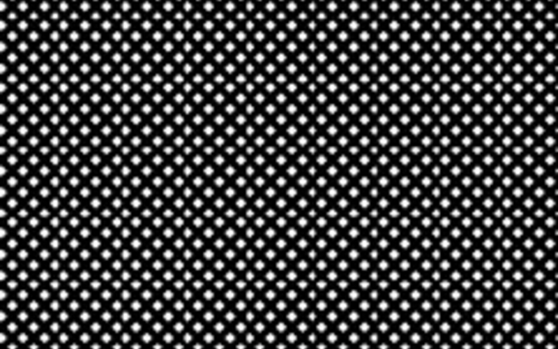 A representation of a section of a glass halftone screen, similar to the one used in 1947 to make the reproductions for the book Henri Cartier-Bresson (New York: The Museum of Modern Art). The screen used for that book had approximately 100 clear dots per linear inch, or 10,000 per square inch.The plain one-impression halftone, printed by letterpress, completely dominated mass-produced photographic publications from about 1900 until the refinement of photo offset lithography in the 1960s. The halftone was cheap, easy to make and print, lent itself to the production of stereotypes (which allowed both type and pictures to be printed on rotary presses), and gave a passable level of quality for most uses. A surprising thing about this technique is that it changed so little between its invention and its demise. The halftone negative was made by photographing the original through a glass screen ruled with a network of tiny apertures. These apertures produced diffuse dots of light that struck the sensitive film or plate.Glass Halftone Screen
 -
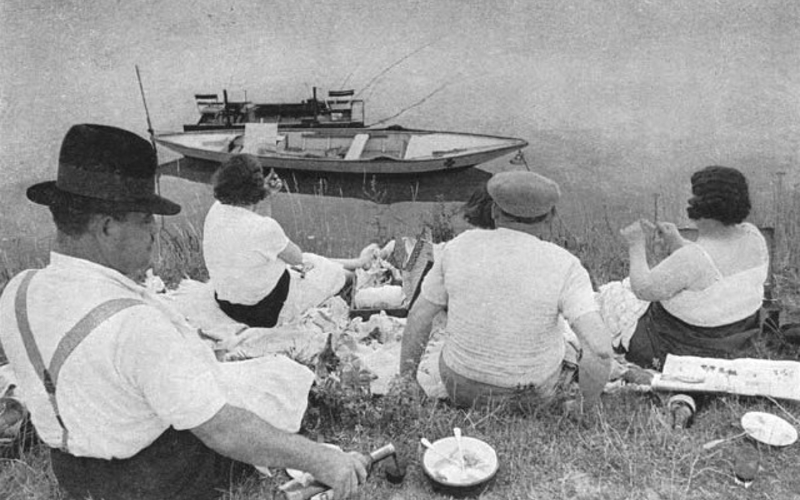 Halftone print. Henri Cartier-Bresson. Sunday on the Banks of the Marne, France. 1936–38 (printed 1947). 4 x 5 7/8" (10.2 x 14.9 cm). Letterpress printed halftone from Henri Cartier-Bresson (New York: The Museum of Modern Art). © Henri Cartier-Bresson/Magnum, courtesy Fondation Henri Cartier-BressonWhen developed with a high-contrast developer, the dots appeared solid in the negative, but varied in size according to the intensity with which each had been illuminated by the original. The halftone negative thus produced was exposed by contact to a light-sensitive resist coated on a sheet of copper. The resist—usually a fish or animal glue sensitized with bichromate—hardened where exposed to light; the unexposed resist between the dots remained soft, and was washed away, uncovering the copper. Next came an etch (usually ferric chloride), which dissolved these areas of bare copper, the spaces between the dots. As it cut below the surface of the copper it also cut into the sides of the dots, which diminished in size, making the print lighter and lighter as the etching went on.Halftone Print
 -
 Enlargement of Halftone print. Henri Cartier-Bresson. Sunday on the Banks of the Marne, France. 1936–38 (printed 1947) 4 x 5 7/8” " (10.2 x 14.9 cm). Letterpress printed halftone from Henri Cartier-Bresson (New York: The Museum of Modern Art). © Henri Cartier-Bresson/Magnum, courtesy Fondation Henri Cartier-Bresson. An eight-times enlargement showing the halftone dot pattern. Imperfect inking and squeezed transfer of ink to paper have produced considerable distortion of the halftone dot.This undercutting could be arrested, through an etching trick with a compound called “dragon’s blood” (believe it or not), but the undercutting supplied a practical limit to the ruling of the screen—about 150 dots per linear inch. Smaller highlight dots from a finer screen would be eaten away and not print. No matter how well a letterpress halftone is printed, the image will have a somewhat rough appearance and the resolution will be low when compared to an actual photographic print. The second major difficulty with the letterpress halftone was that it only printed well on a hard, smooth, clay-coated sheet.The copper plate had to be lightly inked (to avoid filling in the spaces between the dots), then evenly pressed against the paper. Halftones were printed on presses that held the paper on a cylinder, so that the full pressure of the press was applied to the narrow section of the plate that the cylinder contacted. Both paper and copper are hard, so if either one was at all uneven, or if the pressure was not quite right, the transfer would be flawed and the print would suffer. The vast majority of printed letterpress halftones had visible difficulties because of imperfect ink transfer. This problem was never solved, and offset printing, which uses a soft intermediate blanket between plate and paper to sidestep the whole issue, would completely kill letterpress within a couple of decades of its perfection in the years following World War II.Enlargement of Halftone Print
Magazines (16:27 - 21:01)
-
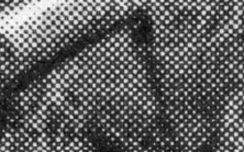 Detail of Halftone print. Henri Cartier-Bresson. Sunday on the Banks of the Marne, France. 1936–38 (printed 1947). © Henri Cartier-Bresson/Magnum, courtesy Fondation Henri Cartier-Bresson. An eight-times enlargement showing the halftone dot pattern. Imperfect inking and squeezed transfer of ink to paper have produced considerable distortion of the halftone dot.By the turn of the century—that is, of the nineteenth to the twentieth—photographs were everywhere. The medium had been alive for sixty years, the old handmade photographic processes were on the way out, and the dry plate, burrowing its way into society through the efforts of George Eastman, was responsible for millions of photographs. The thing that was missing in all this was the cheap, throwaway, mass-produced photograph. As long as photography was based on chemical processing and individually developed prints, it was destined to be marginal in its social effect. The cheap and reasonably adequate single-color halftone met this evolutionary challenge.Within the next fifty years an astonishing number of pages were printed holding ink-generated photographs. These turned up in books and newspapers, but a huge portion of them appeared in magazines.Detail of Halftone Print
 -
 Detail of Wood engraving and halftone print. Photographer unknown. The Pavilions of the Paris Exhibition. 1889. 15 x 10" (38.1 x 25.4 cm). The Museum of Modern Art, New York. Gift of Richard Benson.Magazines bridged the gap between the one-day-relevant newspaper and the more expensive, permanent book. They could deal with news and popular subjects and could lie around the house for a while before being thrown away. Most newspapers were local events, printed in enough copies to satisfy the nearby population, and the book tended to be a national item, made in a few thousand or so copies on the gamble that it would reach enough buyers to sell out the edition. The magazines, on the other hand, adjusted the size of their runs to a growing national audience. Rapidly produced—often weekly—their editions routinely went into the hundreds of thousands, and the industrialized world was quickly wrapped in cheap photographs printed as ink halftones.Detail of Wood Engraving and Halftone Print
 -
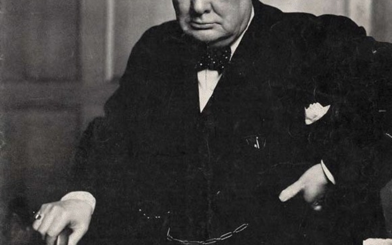 Halftone print. Yosuf Karsh. Winston Churchill. 1941 (Printed 1945). 10 1/2 x 14" (26.7 x 35.6 cm). The Museum of Modern Art, New York. Gift of Richard Benson © Time, Inc. The cover of Life magazine, May 21, 1945.The halftone block was originally a flat thing—copper tacked onto wood, locked into a chase with metal type. The magazine revolution happened when this simple image-bearing tool became thin and curved and could be mounted on a rotary cylinder. This was achieved through the technique of the stereotype, which was a casting, or electroplated replica, of the halftone block. Stereos were made in a number of ways, but every method ended up with a thin, tough relief plate that rotated in the press instead of moving through it in a reciprocating pattern. Rotation brought speed, and reduced the time spent on each unit printed. Time is money, so this window of efficiency gave rise to millions of photographs that could be looked at, read about, and then casually discarded until the next set arrived at the newsstand or in the mailbox.Halftone Print
Duotone Letterpress Halftone (21:07 - 24:44)
-
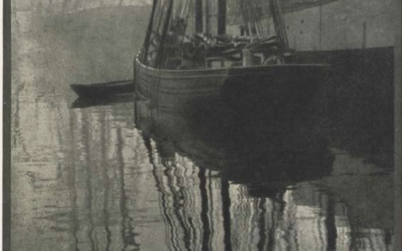 Halftone duotone print. Alvin Langdon Coburn. The Spider’s Web. c. 1905. 10 1/4 x 7" (26 x 17.8 cm). The Museum of Modern Art, New York. Gift of Richard Benson. An untrimmed proof sheet for a plate in Camera Work 21 (January 1908). This duotone shows the register marks at top and bottom that guided the printer in aligning the two impressions.The simple halftone aspired to be upper class and to work as a luxurious method for making beautiful photographic reproductions. Its primary limitations were in the dot size—always coarse enough to be visible to the eye—and short tonal scale, imposed by the difficulties of inking and printing a delicate relief plate. A third problem with the halftone was the absence of a single halftone negative accurately rendering the full tonal scale of the photograph. The smooth, even steps of tone in photographic prints became a rough, erratic set of gradations in the simple dot-constructed halftone. A partial solution was to print a picture in more than one impression, using two different halftone negatives made by photographing the original print twice. The technology wasn’t too complicated; it required negative images that were of identical size, which was easy when glass plates were used.Halftone Duotone Print
 -
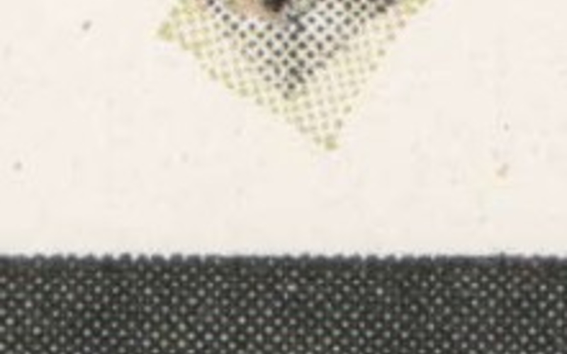 Detail of Halftone duotone print. Alvin Langdon Coburn. The Spider’s Web. c. 1905. 10 1/4 x 7" (26 x 17.8 cm). The Museum of Modern Art, New York. Gift of Richard Benson. This letterpress duotone was printed with two colors: a black and a pale green. The green is nearly invisible when examined with a magnifying glass, but gives a distinct green cast to the print. The register mark, never cut off this proof sheet, shows the two inks and their respective screen patterns.When one halftone was printed over another a terrible pattern could form called a “moiré,” which was a frequency-interference pattern between the screens if they were not exactly aligned. This problem was avoided by tilting one screen thirty degrees away from the other, a solution that had been discovered by hand engravers many years before when working with overlays of linear designs. It turned out that even without much refinement in the way the halftones were made, a two-impression reproduction, printed first in black and then in gray ink, could look far better than any single one.The second set of dots in gray ink, even though they were pale, added body to the black parts of the picture and made the areas of middle and light values much smoother. This new development—the duotone—appeared in art books and other expensive publications where image quality was the first concern. Duotones first showed up at the start of the twentieth century and became common by the 1930s. Extremely beautiful photographic reproductions were already being made in the first half of the century by the technique of photogravure, but this intaglio medium was very expensive. The multiple-pass duotone, though more expensive than a halftone, was still far cheaper than gravure, so it had a viable role in photographic ink printing. The presses never really registered the sheets accurately when printing duotones, but the second impression, being gray, could be a bit out of alignment and still improve the reproduction. Perfect registration had to wait for the multicolor offset presses designed to print color for advertising purposes.Detail of Halftone Duotone Print
Process Color in Relief Printing (24:36 - 27:10)
-
 An early color reproduction, using a primitive linear screen instead of the halftone dot. This image was supposedly the first color photograph transmitted by wire, in 1924. Reproduced from A Half Century of Color, by Lewis Walton Shipley, published by the Macmillan Company in 1951. Reproduced in approximately actual size.The development of color printing was entirely due to the belief that you had a better chance to sell someone something they didn’t need if you advertised it in color rather than in drab old black and white. The theoretical basis for color printing was laid out by James Clerk Maxwell in the mid-1800s, and decades of work in chromolithography had demonstrated the social power of ink images in color. By the 1940s color halftones were making their mark in magazines and books, printed by a method called “process color,” which was becoming firmly established. A key element in the spread of color was the construction of multiunit printing presses that could lay down all four process colors—the subtractive primaries of cyan, magenta, and yellow, plus black—in one pass.Early Color Reproduction
 -
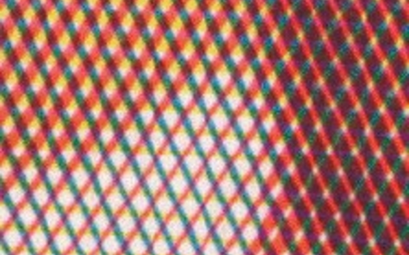 An eight-times enlargement from the print on the previous page, showing the screen pattern, which varies in line width to increase or decrease tone. This print resolves the problem of the moiré patterns by not using a black printer, reducing the number of screens to three.The color reproductions printed with letterpress were never very good, but color had such commercial power that all printing technologies ultimately became color mediums. From its introduction before World War II, color printing grew so robustly that by the 1970s the printing press manufacturers—by that time making letterpress, offset, and gravure presses—were building more and more presses that printed four colors at once. Today, the single-unit press is an anachronism and huge, expensive, four- and five-color behemoths are everywhere. They crank out books and magazines and above all marketing catalogs in huge numbers. Today the process is usually photo offset lithography but its roots lie in letterpress, where the simple old copper halftone was refined to print three primaries in register to give the illusion of full color.Early Color Reproduction
 -
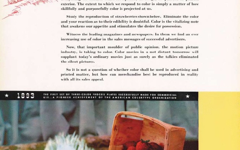 Process-color halftone print. Photographer unknown. Pioneers in Color Reality. 1936. 13 3/4 x 11" (34.9 x 28 cm). The Museum of Modern Art, New York. Gift of Richard Benson. From the trade magazine Advertising Agency, September 1936.Idealized three-color printing, using cyan, magenta, and yellow, never worked properly because it produced an inadequate black, so right at the start a fourth impression, in black ink, was added to the “process” method, which then became known as CMYK printing. It’s critical to remember that color photography itself was still being worked out in the 1930s and 1940s; only after World War II did chemical color photography become first-rate and widespread. Color in ink was never top-notch until the development of the computer. Designers and publishers of art books tore their hair out trying to make fine color reproductions, and even now, when the technology of printing is completely embedded in the digital stew, pictures often turn out badly.Process-Color Halftone Print
Flat-Plate Photogravure (33:01 - 40:51)
-
 Photolyphic engraving, irreg. William Henry Fox Talbot. Untitled. c. 1852. 2 5/16 x 3 7/16” (5.9 x 8.8 cm). The Museum of Modern Art, New York. Gift of the International Museum of Photography at George Eastman House. Many early attempts were made to print photographs with ink. This small experimental print, which Talbot called a “photoglyptic engraving,” was an attempt to make an intaglio reproduction of a pair of calotypes.We leave relief printing now and move back in time to the adaptation of intaglio printing to the photographic image. The copper plate, dampened paper, etching press, and silky aquatint were all waiting in the wings for the invention of photography. If you believe, as I do, that photography was invented because the printing presses of the world needed more data than the hand could provide, then the early development of photogravure seems an inevitable step. By the 1880s photogravure had reached a state of near perfection, due to final refinements by Karl Klíc. The process combined all the tools of etching and aquatint with the tonal description of the photographic carbon print. Though the steps in making a gravure are complex, we can describe them quite easily, because we have previously described both aquatint and carbon printing.Photolyphic Engraving
 -
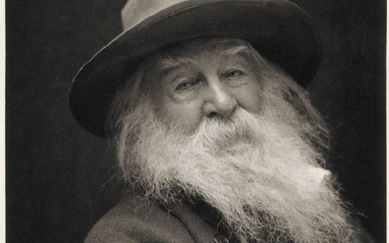 Hand gravure. George C. Cox. Walt Whitman. c. 1887. 10 1/4 x 7 5/8" (26 x 19.4 cm). Printed by Photographische Gesellschaft, Berlin. The Museum of Modern Art, New York. Gift of Richard Benson. Photogravure is an intaglio process of great beauty, but it never became as common as letterpress halftone because it is expensive and requires specialized machinery.A copper plate is polished, cleaned, and dusted with acid-resistant grains in exactly the same way as is done for a hand-drawn aquatint. A sheet of carbon tissue carrying a red pigment is sensitized to light in exactly the same way as the tissue for a carbon print. This tissue is then exposed to a film or glass-plate positive (instead of a negative), and the carbon/gelatin image is pressed to the aquatinted copper plate instead of to a sheet of receiver paper. Once the tissue is removed by development in hot water, the plate is dried and then etched, using a heavy solution of ferric chloride in water. This is where the magic takes place. The crucial ingredient in the resist now transferred over to the aquatinted copper plate is not the pigment but the gelatin.Hand Gravure
 -
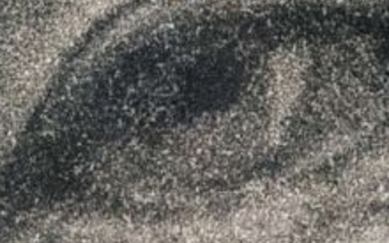 Enlargement of Hand gravure. George C. Cox. Walt Whitman. c. 1887. 10 1/4 x 7 5/8" (26 x 19.4 cm). Printed by Photographische Gesellschaft, Berlin. The Museum of Modern Art, New York. Gift of Richard Benson. A seven-times enlargement showing the fine grain of the ink-bearing aquatint cells.A carbon print consists of a gelatin layer that varies in thickness according to the values coming from its exposure. Because the gelatin layer now stuck to the aquatint was made from a positive rather than a negative, it is thin in the shadows of the picture and thick in the highlights. When placed in the etching bath the gelatin slowly takes up water and swells, and as it does so the ferric chloride is able to move through it. In the dark areas of the picture, where the gelatin is thin, the iron compound quickly reaches the copper and begins to etch the fine spots left open by the aquatint. The lighter values are etched later, after the necessary time has passed for the gelatin to swell and allow ferric chloride to pass through those areas. After the etch has reached all parts of the picture, it is stopped and the resist and aquatint are removed. The plate now carries a set of ink-bearing pits that have been etched for variable amounts of time in inverse proportion to the thickness of the gelatin layer that had been applied to the surface. This variable depth, when printed, lays down ink of variable thickness to generate tone. Because photogravure depends upon an ink film that varies in thickness to show tonal differences, it uses an ink that is less dense than that for other processes, where the requirement of the ink is to simply be as black as possible.Enlargement of Hand Gravure
Art Photogravure (40:54 - 44:13)
-
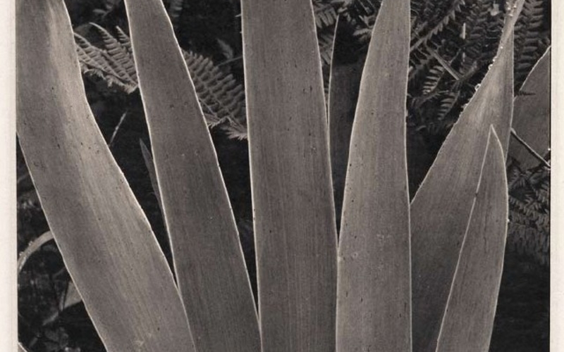 Hand gravure. Paul Strand. Iris. 1928 (Printed by Jon Goodman and Richard Benson, 1978). 9 13/16 x 7 7/8" (25 x 20 cm). Berlin. The Museum of Modern Art, New York. Gift of Richard Benson © Paul Strand Archive, Aperture Foundation, Inc.When an aquatint was well made, it provided printing cells that were virtually invisible to the naked eye. When a gravure resist was properly etched, it not only described a full range of tones but even allowed their internal relationships to be adjusted to make the information from the negative more effective. When both these things happened in a gravure, and the originating photograph had a fine tonal scale, the result could be more beautiful than anything else in photography. Yet the tone and clarity were only part of the reason for this. Much of the glory of photogravure came from its capacity to produce a deep black value on a totally matte surface. There has long been a war between the glossy surface and the matte. It began at the very start of photography as the brilliant, ultimately glossy daguerreotype battled with the soft, matte-surfaced salted-paper print. When paper won the battle with the decisive tool of the albumen print, it did so with a semigloss surface that could reveal the long range of tones carried by the new glass wet-plate negatives. Later on, when the silver-based developing-out papers came to dominate photography and when chromogenic color papers were made, gloss surfaces won hands down.Hand Gravure
Rotogravure Using Mechanical Screens (44:13 - 51:37)
-
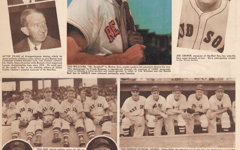 Rotogravure. Leslie R. Jones. American League Champions from Boston Sunday Herald, September 29, 1946. 1946. 22 1/2 x 15 1/4" (57.2 x 38.7 cm). Courtesy Boston Herald. The designer of this rotogravure sheet is unknown.Photogravure was a hand process. The aquatint was applied to a flat plate, etched in a sequence of trays, then inked and wiped by hand, and finally run through a press—as often as not driven by a hand-operated wheel. This great process could not enter the long-edition book world until it left the hand behind and became mechanized. This changeover took place early in the twentieth century. The first thing to go was the aquatint. Finely ruled halftone screens were around by that time, and specialized ones were made for gravure that didn’t use dots but instead held a fine screen, a rectilinear grid much like a window screen but in negative form. This screen was exposed to the carbon tissue first and the picture positive was exposed afterwards. Once transferred to the plate, the screen image protected the copper, so that the etching took place only in the screen’s tiny “windows.”The random cells of the aquatint were thus replaced by square ones, absolutely predictable in form. The next change was to get rid of the flat plate; now the etching was done on thin copper sheets—about .025 inch thick (.06 mm)—that could be wrapped around a cylinder. Later on even this plate disappeared, replaced by chrome-faced cylinders with copper electroplated onto them in which the image was etched. The remaining problem to be solved was the wiping, for which a tool was invented called the “doctor blade.” This device, acting like a windshield wiper, ran across the plate surface and removed all the ink from the top but not from the printing cells. The old stiff gravure ink was changed to a more fluid one, and the doctor blade became a very long, thin band of metal that wound steadily across the plate as it wiped, to avoid nicks and grit that could create lines running through the whole print run. The old flat-plate photogravure had been called “hand,” “grain,” or “helio” gravure. The new mechanized form was called “rotogravure,” reflecting the purely rotary nature of the presses: not just the plate but the paper were handled by cylinders. This was what made high-speed printing possible. The new gravure retained much of the beauty of the old hand methods. It could use matte inks, and the plates were still made from film positives, so a long tonal range was attainable. The fine printing cells, holding ink of variable thickness, gave a true rendition of tone. This printing became the standard for photographically illustrated books in Europe. The French and Swiss printers reached a high point in bookmaking with Cartier-Bresson’s The Decisive Moment and Frank’s The Americans (there respectively titled Images à la sauvette and Les Américains), but many other glorious books made in this process are still out there and available inexpensively in used-book stores. The pictures may or may not be great art but the printing is among the very best ever done.Rotogravure